
01
Burn Up Chart
Set a scope target and watch completions climb toward it. A straight-line forecast with ±% scenario lines shows when you'll finish — honest range, no false precision. Focus mode auto-sizes to the forecast window.
Drop in your CSV and get cycle time, throughput, WIP, aging work, a CFD, and a Monte Carlo forecast — instantly. Share any chart with one click. No login. No server. Your data never leaves your machine.
Single HTML file · any modern browser · currently free
No vanity charts. Flow metrics, probabilistic forecasts, and a period-over-period health scorecard — the things that tell you whether your system is healthy and where to look when it isn't.
Set a scope target and watch completions climb toward it. A straight-line forecast with ±% scenario lines shows when you'll finish — honest range, no false precision. Focus mode auto-sizes to the forecast window.
What can we close by this date? Probabilistic answers at 95th, 85th, 70th, and 50th confidence — calculated from your own delivery history. Replace gut feel with a number you can actually defend.
One click copies any chart as an image. Paste it straight into Slack, Teams, Jira, or a report. No login, no link, no permissions to manage. If you can see it, you can share it.
This period vs the previous one of the same length: throughput, cycle time, WIP, flow efficiency, blocked count. Green, amber, red — no theatre, just the signal.
Every key metric split by any column in your data — bug vs feature, team, priority, whatever matters to you. See which category is dragging down your cycle time and by how much.
Every in-progress item plotted by stage and age, colour-coded against your own completed cycle time percentiles. The red dots are the ones to talk about today.
Percentile control chart and histogram. p50, p70, p85, p95 lines drawn from your data. Outliers jump out immediately — click any dot to see what it is.
Interactive CFD with zoomable date range. Band height is WIP, slope is throughput, horizontal distance is cycle time. Bottlenecks are visible before they become fires.
Weekly completion bars with a rolling average. Click any bar to see every item delivered that week. Flat and steady is the goal — spikes and gaps tell the story.
Automatically flags items with missing dates, backwards stage order, negative cycle times, and more. Know what's in your data before you trust it — because garbage in means garbage out.
See exactly where items spend their time. Median and 85th percentile days per stage, colour-coded by active work vs queue. If one stage dwarfs the rest, that's your bottleneck.
Items entering the workflow vs items completing, plotted week by week. When arrivals consistently outpace departures, WIP is growing and cycle times are about to rise. The early warning chart.
"Drop in a CSV. See your flow in sixty seconds."
One HTML file. Save it somewhere handy. That's the entire install.
Double-click it. Chrome, Edge, Firefox, Safari — any modern browser. Offline is fine.
Stage columns are detected automatically. Label each stage once — active work or queue — and every chart appears instantly.
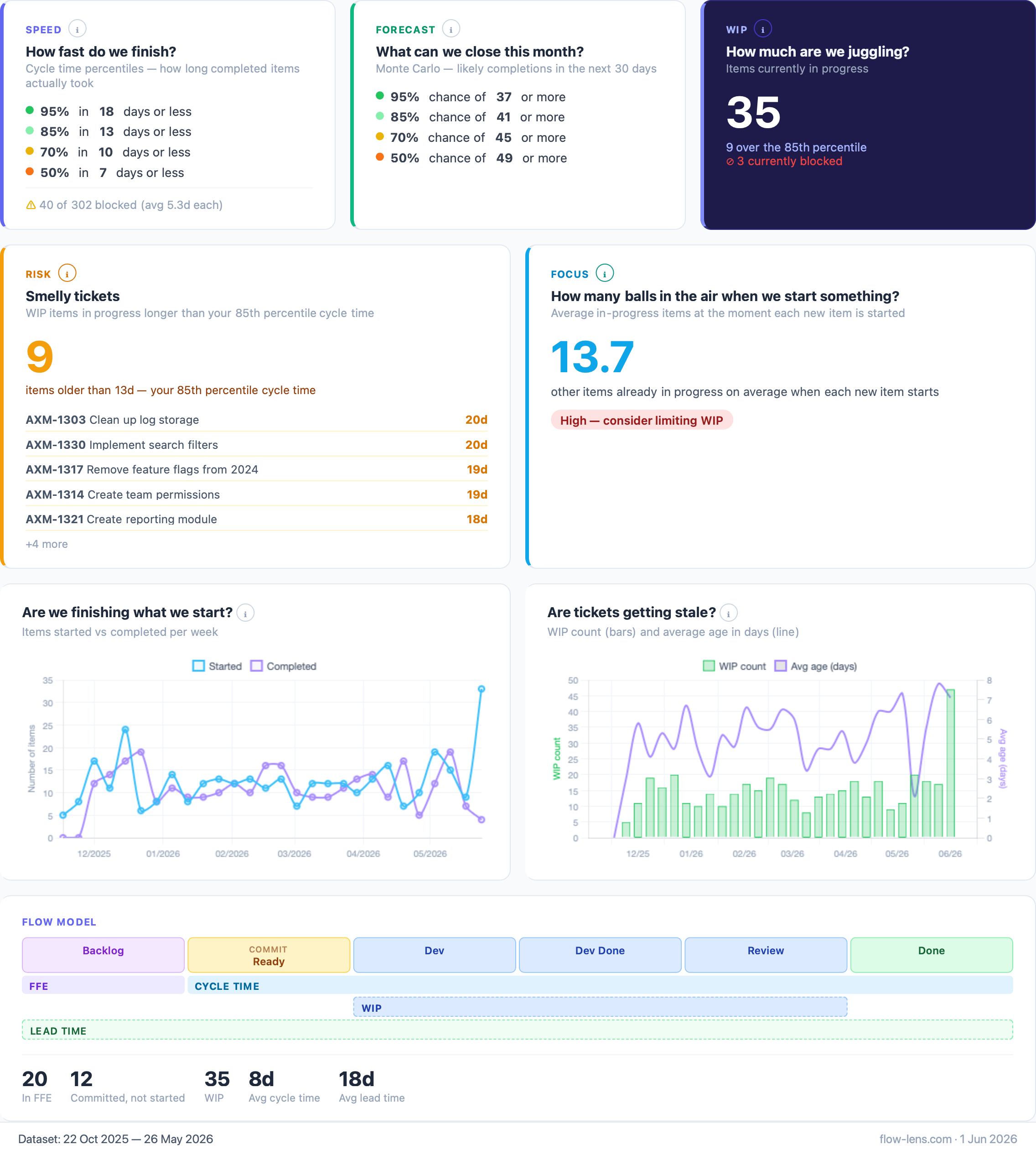
Speed, forecast, WIP, risk, and focus — the whole system at a glance. Smelly tickets, focus score, and a mini arrival vs departure view built in.
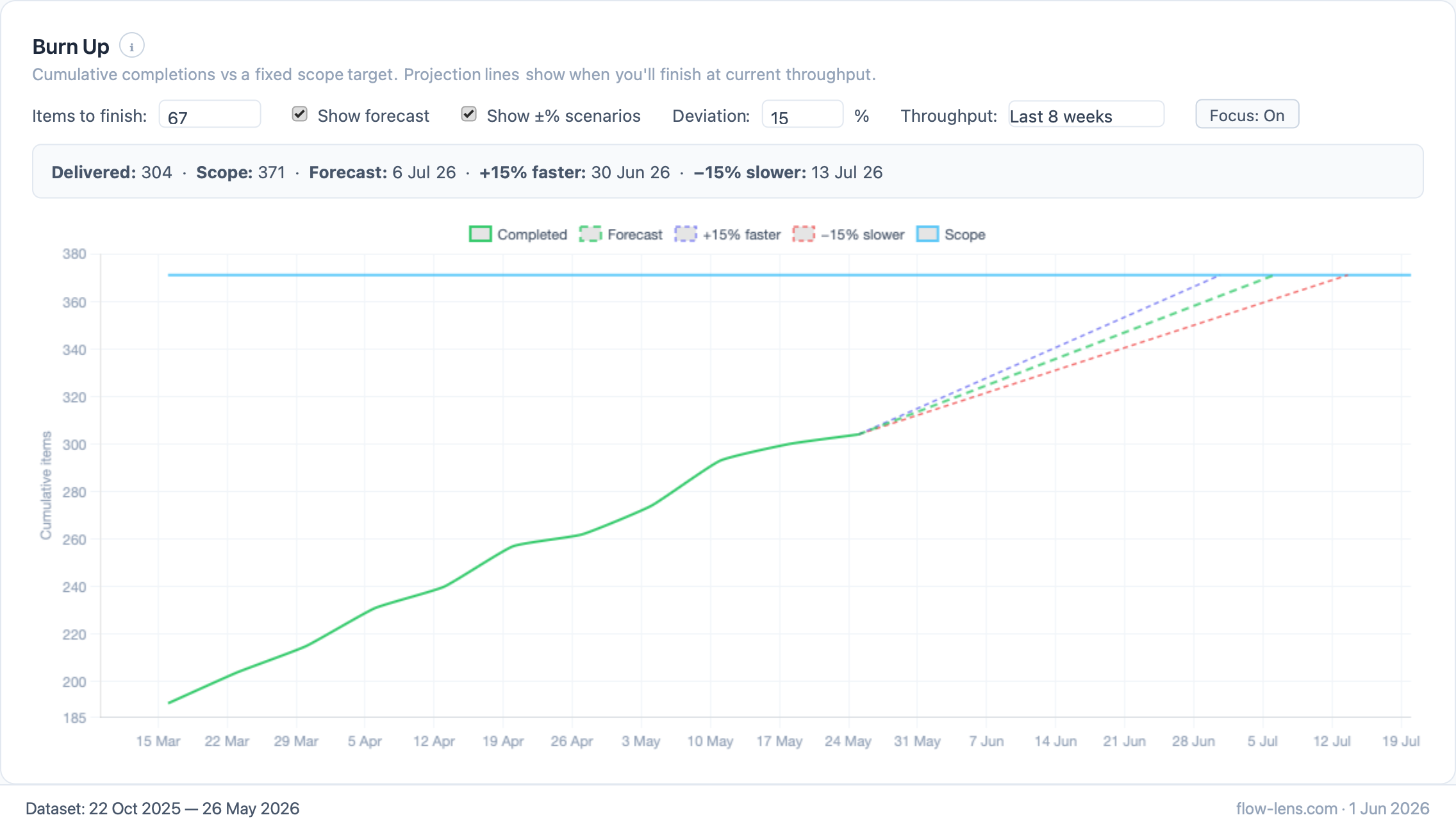
Scope target, completions, and straight-line projection to finish. The ±% scenario fan shows your range honestly — no false precision.
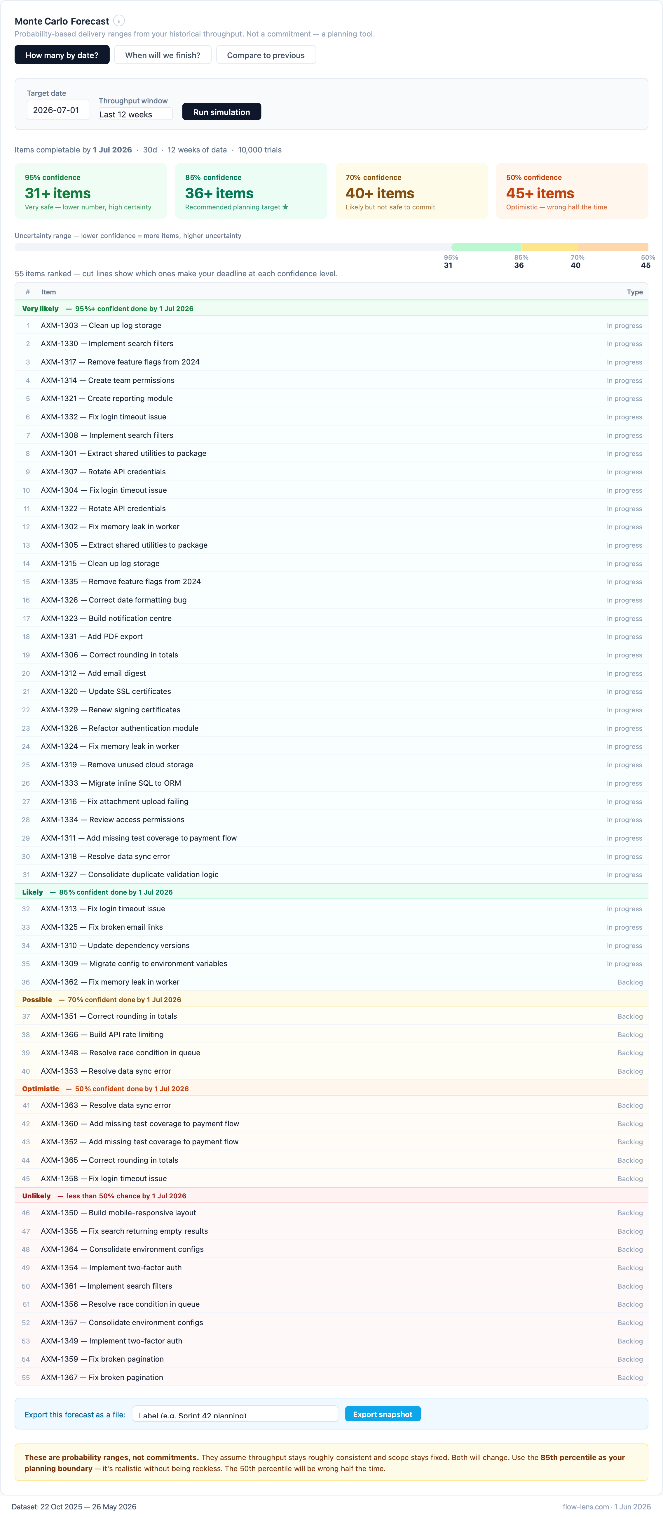
10,000 simulations from your own delivery history. Every item ranked by confidence — know exactly which ones make your deadline and which don't.
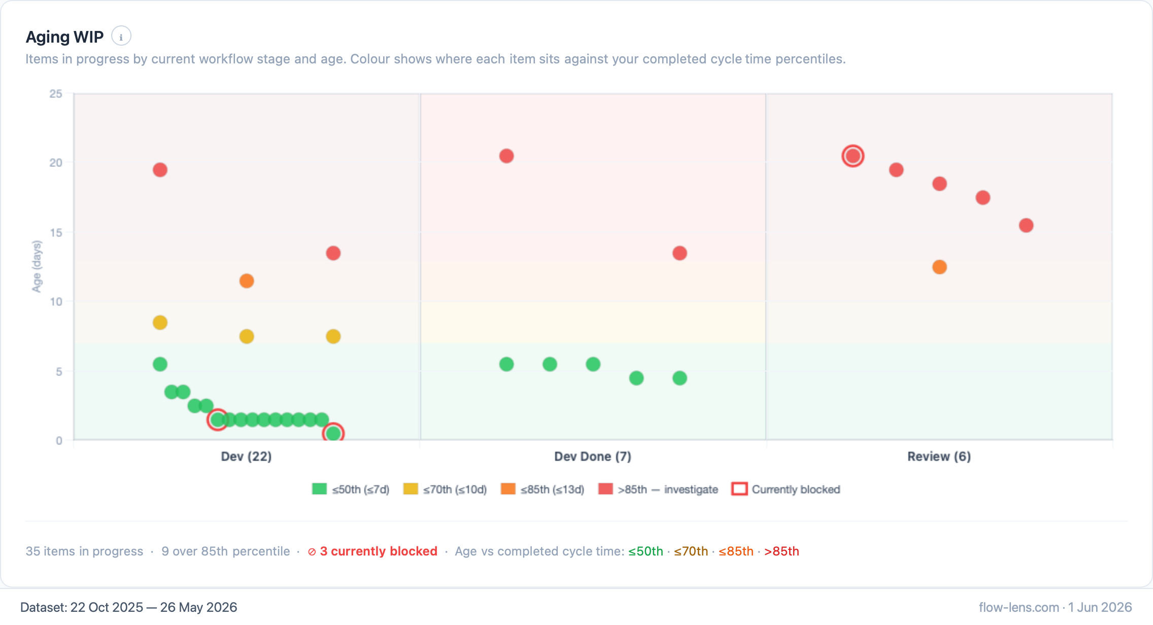
Red means act now. Every dot is a real item in progress, coloured against your own percentiles. No guessing which tickets to chase today.
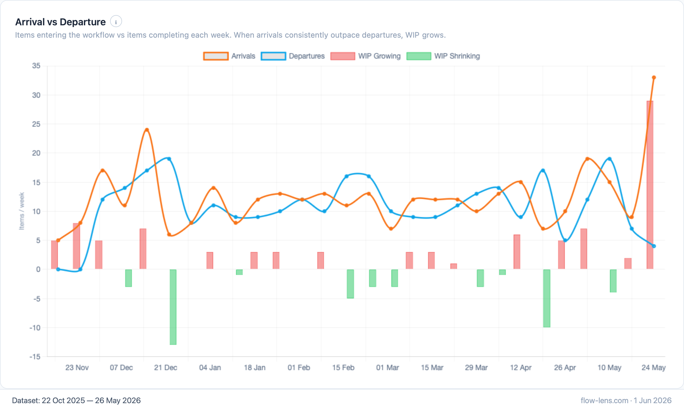
Items starting vs items completing each week. When the orange line stays above blue, WIP is growing and cycle times will follow.
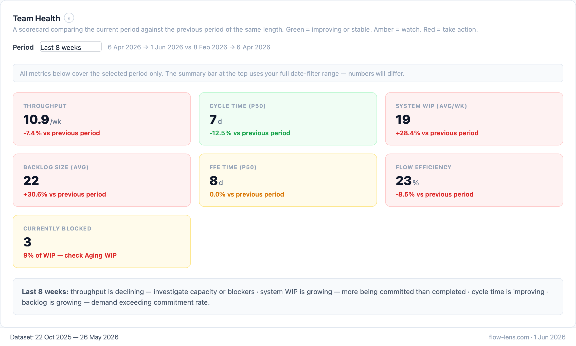
This period vs the last one of the same length. Throughput, cycle time, WIP, flow efficiency, blocked — green stable, amber watch, red act.
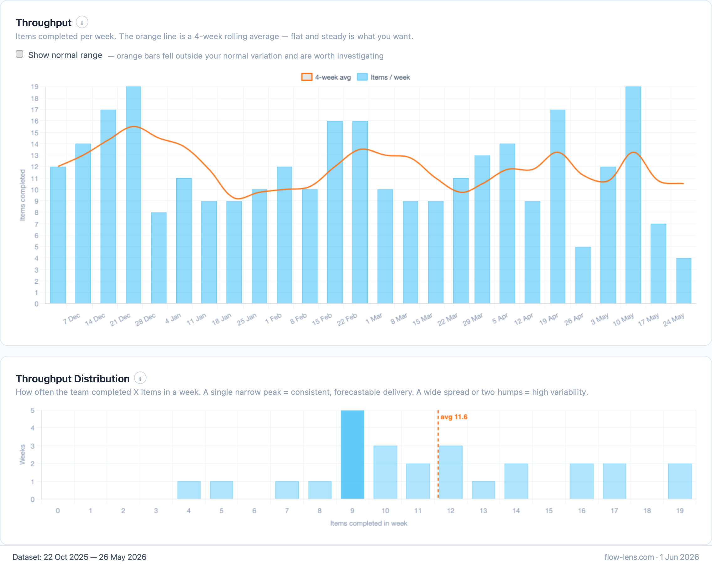
Weekly completions with a 4-week rolling average and distribution histogram. Click any bar to see every item delivered that week.
Flow Lens is a single HTML file. It reads your CSV with the browser's File API, holds it in memory, draws the charts, and forgets it the moment you close the tab. There is no server, no account, no telemetry, no cookies — nothing to approve, nothing to breach.
Need the CSV format? The data format guide has a full example with column definitions.
Currently free to download and use · no account · no catch